I have just got back from a presentation at the Regent Street Apple Store. The presentation was by geographer Ned Gardiner and animator Arlene Ducao from the American Museum of Natural History’s Science Bulletins programme.
The presentation was about the visualisations they produce for the Museum. These visualisations are used in the Museum, are syndicated across the USA to other museums, used by scientists are are available from the website http://sciencebulletins.amnh.org .
They showed three visualisations on Stratospheric Ozone, Sea Ice and Urban Sprawl.
Introducing the talk.
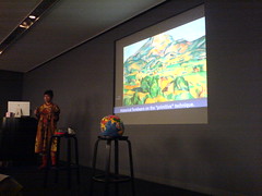
Arlene talks about “primitive” technique – Cezanne and Cubism, George Boole and boolean algebra.
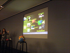
Why do they create visualisations, rather than just use photographs or other media.
Visualisation allows for:
- Manipulation of space.
- Compression of time.
- Extraction of space.
The High Definition renderings of the visualisations are distributed to other museums across the states as part of a subscription service. They download new movies on a weekly basis.
By using satellite data and visualisation techniques they are able to give a:
- Global ‘macroscopic’ perspective.
- Satellite vantage points and designs provide different measurements.
- Make Global change observable.
20 – 30 years ago, earth / planetary science visualisation was done using colour by number techniques, now we can produce complex animated visualisations of what is happening to the earths ecosphere on your desktop.
These visualisations are a vital tool for the geeKyoto project, they help convey the complex science behind climate science and planetary science, developed by people who specialise in producing educational material.
Information on the data sources used in producing the visualisations is given, so you can try and make your own and you can answer questions on the sources if asked.
After the presentation I introduced the geeKyoto project to Arlene and also the concept of the Daily Climate Report, so hopefully we will hear more from the American Museum of Natural History and the team there producing this excellent work.

